Transform ordinary paper ephemera into extraordinary keepsakes with this comprehensive guide to creating collage postcards. Whether you’re crafting heartfelt messages for loved ones or designing display-worthy art pieces, these techniques will elevate your paper crafting to new heights.
Understanding Your Foundation: Essential Materials
Paper Bases That Last
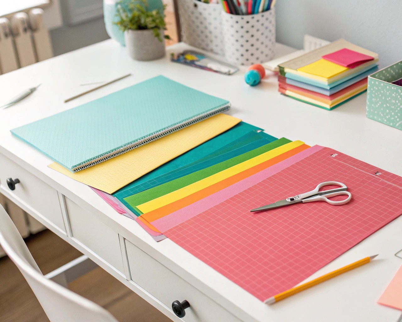
The foundation of any memorable collage postcard begins with quality cardstock. I recommend starting with 16pt cardstock for its superior durability and professional feel. This thickness provides the structural integrity needed for layered collage work while maintaining the classic postcard weight that feels substantial in hand.
For budget-conscious crafters, 14pt cardstock offers an excellent alternative, providing adequate support for most collage techniques while keeping costs manageable. When working with wet adhesives or multiple layers, consider upgrading to heavy watercolor paper (140lb/300gsm minimum), which resists warping and maintains its shape beautifully.
Standard postcard dimensions of 4×6 inches work perfectly for most projects, though you can explore variations like 5×7 inches for more elaborate compositions.
Collage Materials: Building Your Creative Arsenal
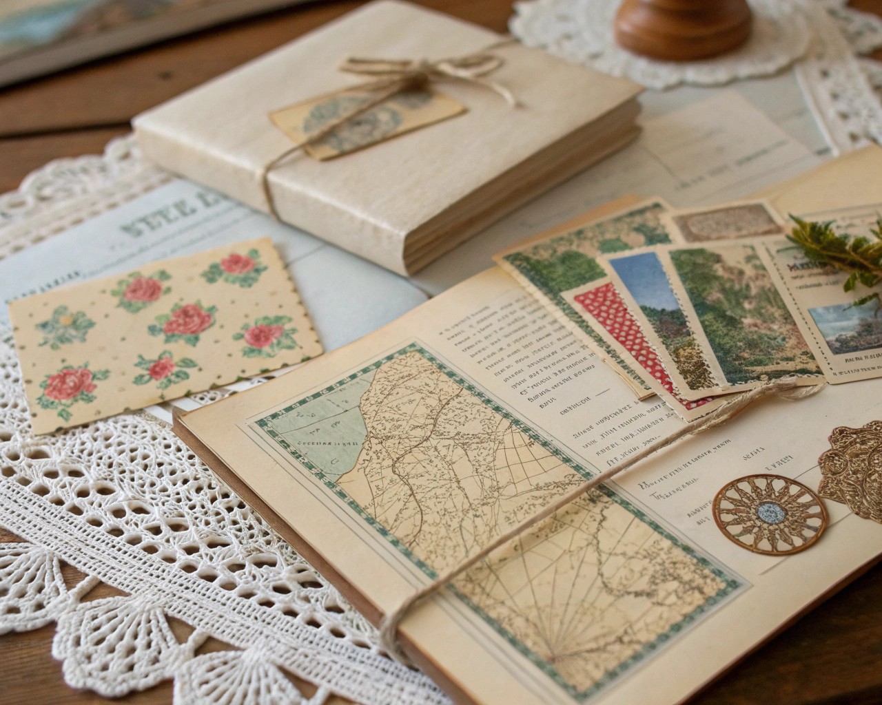
| Material Type | Best Sources | Creative Applications |
|---|---|---|
| Vintage Text Elements | Old books, sheet music, maps | Backgrounds, text overlays, nostalgic themes |
| Visual Elements | Magazine cutouts, photographs, postcards | Focal points, color accents, layered compositions |
| Textural Components | Fabric scraps, lace, dried flowers | Dimensional interest, tactile elements |
| Ephemera | Vintage stamps, tickets, labels | Authentic details, historical context |
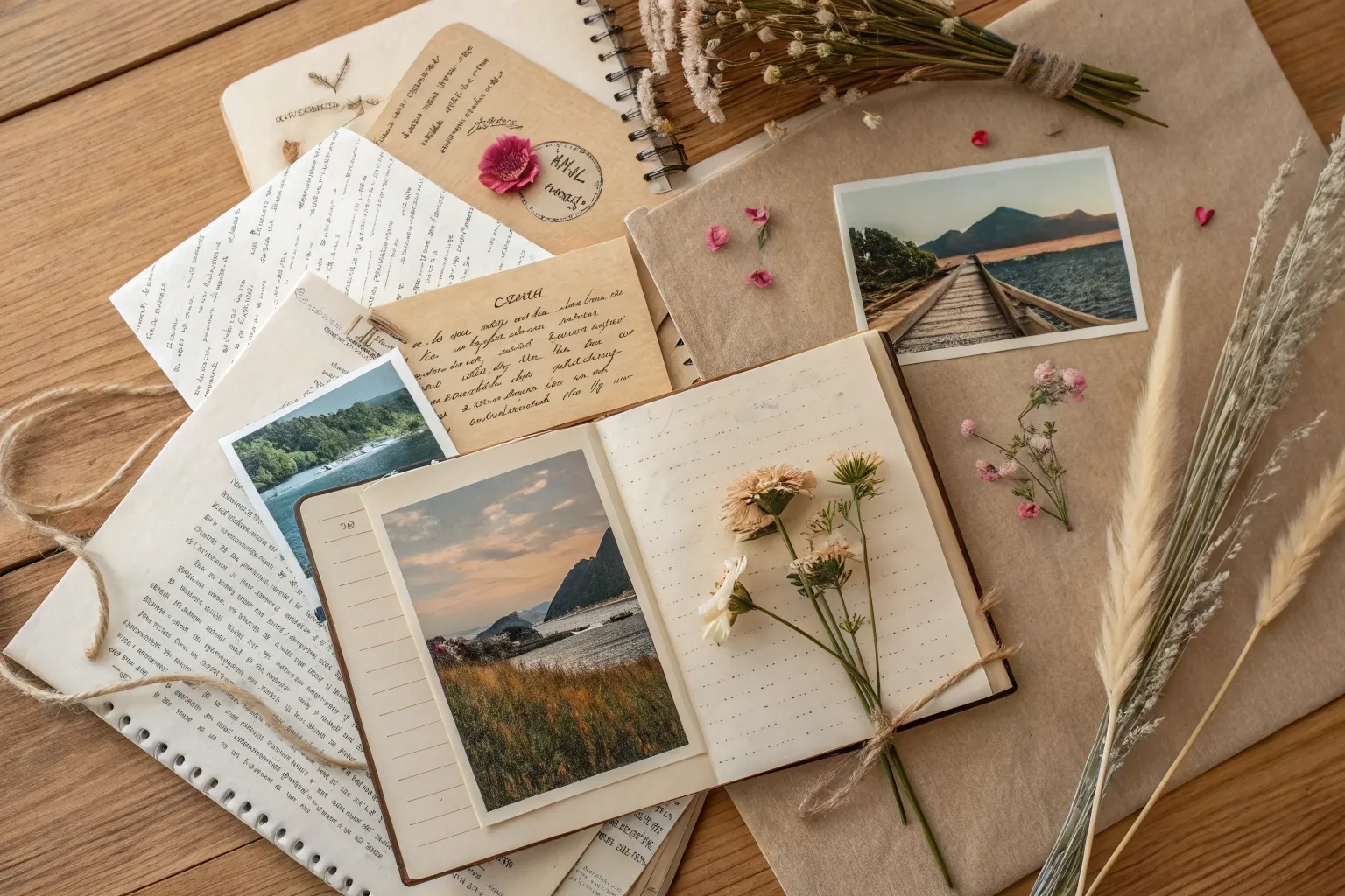
The beauty of collage lies in its accessibility—most materials can be found in your home, at thrift stores, or through specialty ephemera suppliers. I particularly love incorporating elements that tell a story, such as pages from vintage atlases for travel-themed pieces or pressed flowers for botanical compositions.
Adhesives: The Science Behind Lasting Bonds
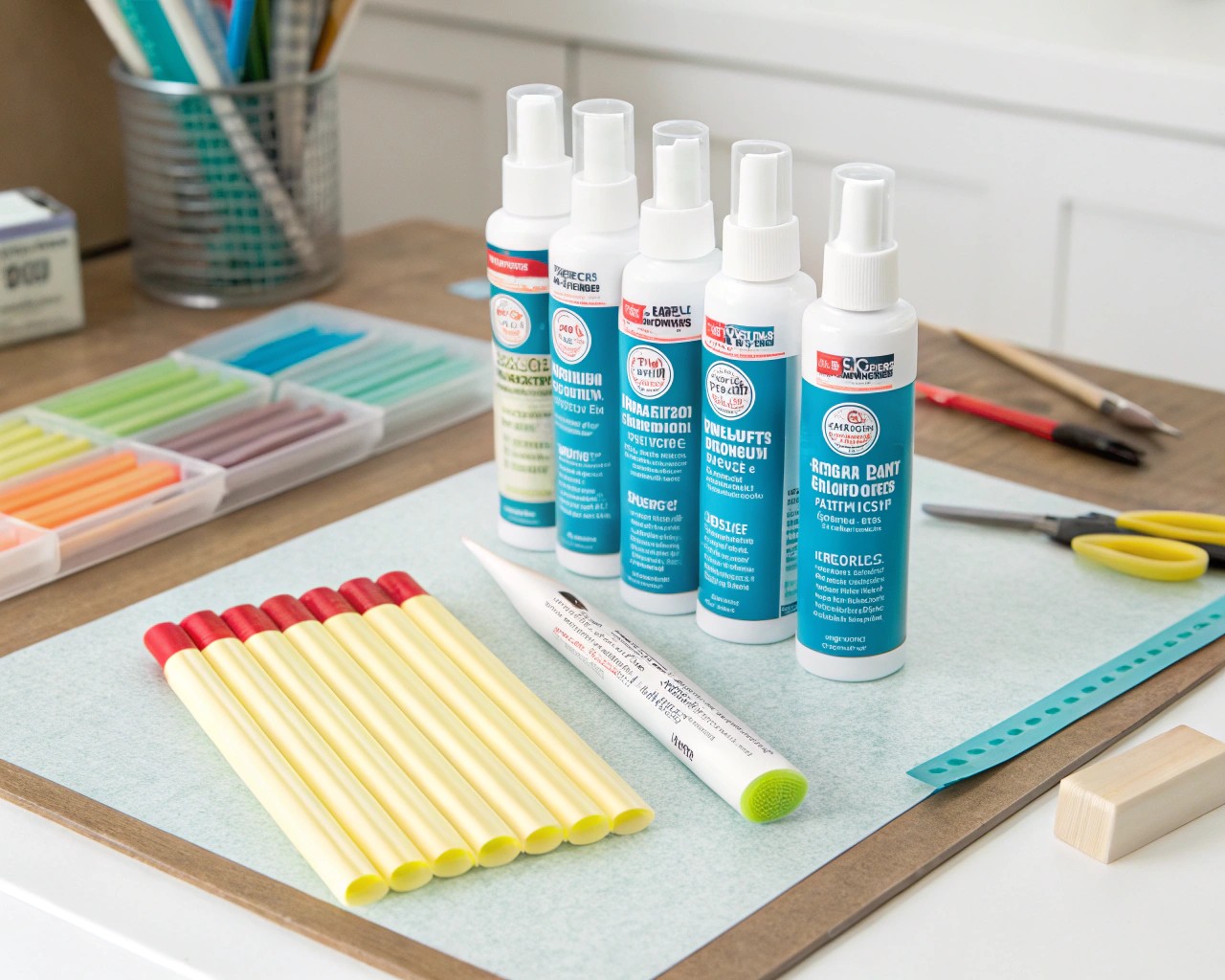
Acid-free glue sticks serve as your primary adhesive for most collage work. They provide adequate working time, won’t bleed through thin papers, and maintain archival quality for long-lasting pieces. Apply glue to the perimeter of elements first, as this prevents edge lifting—a common issue in collage work.
For delicate materials like tissue paper or dried flowers, spray adhesive offers even coverage without excessive moisture. Reserve double-sided archival tape for securing heavier elements or creating clean, raised effects.
Important durability note: Avoid regular tape or non-archival adhesives, as these can yellow, become sticky, or damage your postcards over time.
Design Principles That Transform Amateur to Artist
Color Harmony in Vintage Palettes
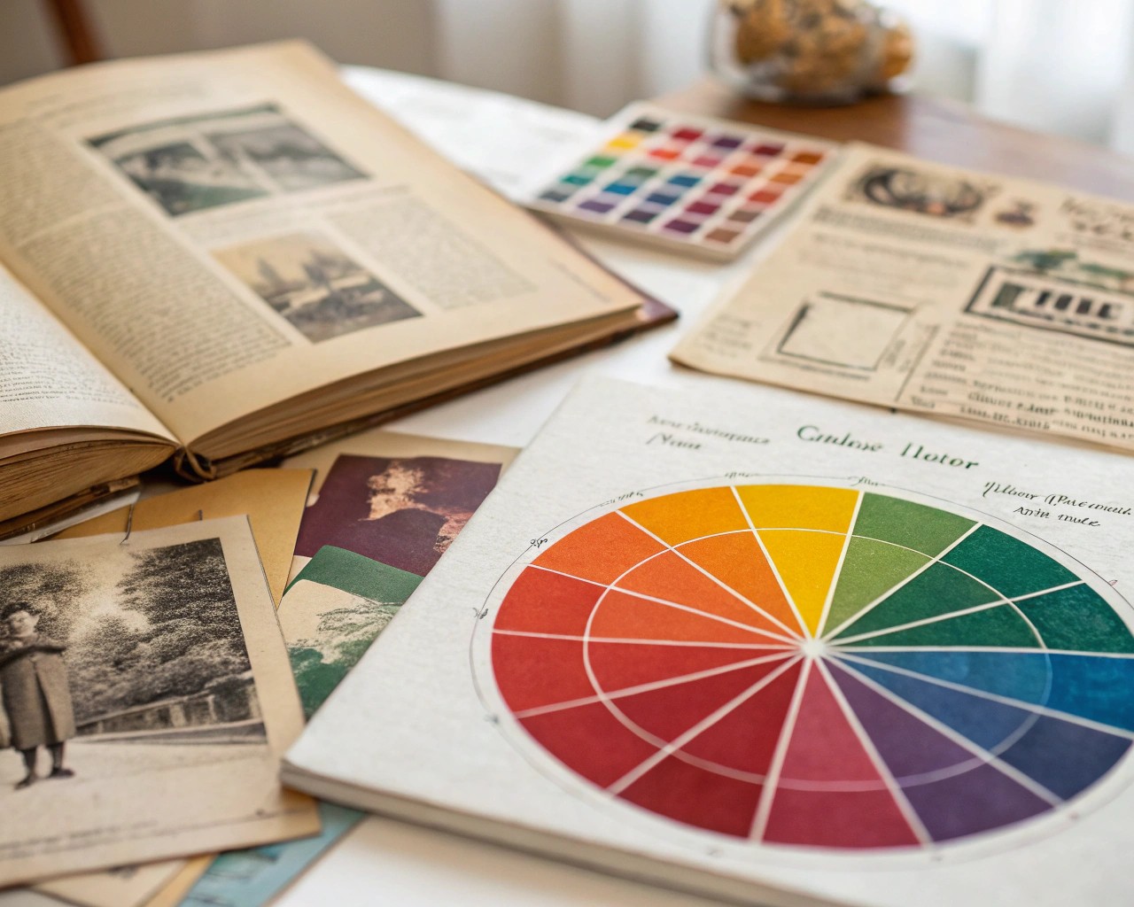
Vintage color schemes form the heart of compelling collage postcards. I gravitate toward muted earth tones—dusty roses, sage greens, warm ochres, and soft blues. These colors naturally complement aged papers and create cohesive compositions that feel intentionally curated rather than randomly assembled.
Color temperature consistency proves crucial. Warm palettes (featuring reds, oranges, yellows) evoke cozy, nostalgic feelings, while cool palettes (blues, greens, purples) suggest tranquility and sophistication. Mixing temperatures can work beautifully, but requires careful balance to avoid visual discord.
Consider these proven vintage color combinations:
- Dusty rose, sage green, cream (romantic vintage)
- Burnt orange, golden yellow, deep teal (70s inspired)
- Muted lavender, pale pink, soft gray (shabby chic)
- Warm brown, mustard, forest green (earthy vintage)
Composition Techniques for Visual Impact
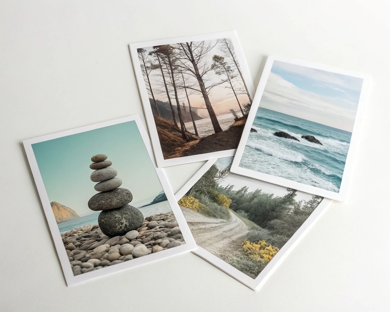
The rule of thirds applies beautifully to postcard design. Imagine your 4×6 inch surface divided into nine equal sections—placing key elements along these lines or at their intersections creates naturally pleasing compositions.
Layering strategy makes the difference between flat, amateur collages and professional-looking pieces. Start with your largest background elements, then build up through medium-sized pieces to small details. This creates visual depth and guides the viewer’s eye through your composition.
Balance considerations:
- Symmetrical balance works well for formal, elegant pieces
- Asymmetrical balance creates dynamic, modern compositions
- Radial balance suits circular or mandala-style arrangements
Step-by-Step Techniques for Professional Results
Basic Collage Foundation
-
Prepare your workspace with adequate lighting and a clean, flat surface. Have all materials within easy reach.
-
Cut your cardstock base to final size, ensuring clean, straight edges using a metal ruler and craft knife.
-
Arrange before adhering—this cannot be overstated. I spend significant time moving elements around, photographing different arrangements, and living with compositions before committing to adhesive.
-
Apply adhesive strategically: For magazine pages and thin papers, use minimal amounts to prevent bleeding. For thicker elements, ensure complete edge coverage to prevent lifting.
-
Use a brayer or bone folder to smooth each element as you place it, working from center outward to eliminate air bubbles.
Advanced Layering Techniques
Transparency effects add sophisticated depth to your work. Layer tissue paper, vellum, or thin fabric over printed elements to create subtle color shifts and mysterious, dreamlike qualities.
Mixed media integration expands your creative possibilities. Consider incorporating:
- Watercolor washes as backgrounds
- Ink stamping for repeated motifs
- Embroidery or stitching for textural interest
- Small dimensional elements like buttons or beads
Photo transfer techniques allow you to incorporate personal photographs seamlessly into vintage collage aesthetics. The key lies in choosing transfer methods that complement your overall color palette and style.
Inspiring Theme Ideas for Every Occasion
Travel and Adventure
Transform vintage maps, foreign currency, and travel ephemera into wanderlust-inducing postcards. Layer torn map sections with travel stamps, vintage airline tickets, and small photographs. The weathered, well-traveled aesthetic resonates strongly with recipients and makes stunning wall art.
Botanical Beauty
Pressed flowers and leaves create naturally gorgeous focal points. Combine them with vintage botanical illustrations, handwritten plant names, and soft watercolor backgrounds. These pieces work beautifully for spring celebrations, sympathy cards, or nature-loving friends.
Literary Romance
Book pages provide wonderful textural backgrounds. Choose meaningful passages, poetry, or sheet music as your foundation. Layer with vintage photographs, pressed flowers, or small illustrations. These make particularly thoughtful gifts for book lovers and writers.
Seasonal Celebrations
Adapt your color palettes and materials to match different seasons:
- Spring: Fresh greens, soft pinks, pressed flowers
- Summer: Bright yellows, sky blues, beach ephemera
- Autumn: Warm oranges, deep reds, fallen leaves
- Winter: Cool blues, silvery whites, vintage holiday imagery
Professional Finishing Techniques
Protecting Your Investment
UV protection extends the life of your collage postcards significantly. If displaying in frames, use UV-filtering glass or acrylic. For postcards you plan to handle frequently, consider applying a light coat of archival sealant—though test this on sample pieces first to ensure it doesn’t alter your desired aesthetic.
Storage considerations matter for long-term preservation. Store flat postcards in acid-free boxes or sleeves, separated by tissue paper to prevent sticking or color transfer.
Display Options That Inspire
Single frame mounting works beautifully for special pieces. Choose frames that complement rather than compete with your collage—simple black, white, or natural wood frames typically work best.
Gallery walls create impressive impact when displaying multiple postcards. Maintain consistent frame styles while varying the postcard themes for visual interest. Grid arrangements provide clean, modern appeal, while organic groupings feel more casual and approachable.
Rotating displays using clip systems allow you to change pieces seasonally or as your collection grows. This approach works particularly well in creative studios or craft rooms where inspiration benefits from regular refreshment.
Troubleshooting Common Challenges
Adhesive bleeding through thin papers can be prevented by using minimal amounts of glue and choosing appropriate adhesive types for each material. If bleeding occurs, allow complete drying before attempting to cover with additional elements.
Warping prevention requires attention to moisture balance. Apply adhesive evenly and avoid oversaturating papers. If warping occurs, place the finished postcard under weighted books overnight to flatten.
Color bleeding from wet media can be controlled by allowing each layer to dry completely before adding the next. Use barriers like wax paper or plastic wrap when working with materials prone to color transfer.
Edge lifting typically results from insufficient adhesive coverage. When applying glue sticks, ensure complete edge coverage, paying particular attention to corners and small protruding elements.
Making It Personal: Adding Your Signature Style
The most compelling collage postcards reflect their creator’s unique perspective and aesthetic preferences. I encourage you to develop signature elements—perhaps a particular color combination you gravitate toward, a specific type of ephemera you collect, or a compositional style that feels authentically yours.
Consider maintaining a creative journal where you photograph arrangements before finalizing them, note successful color combinations, and record sources for particularly effective materials. This practice accelerates your artistic development and helps you recognize patterns in your emerging style.
Remember that collage postcards serve dual purposes—they’re both functional mail art and potential gallery pieces. Whether adorning a refrigerator or hanging in a carefully curated frame, these small artworks carry enormous emotional weight and creative satisfaction.
The magic happens in that moment when scattered ephemera transforms into coherent artistic expression. Through thoughtful material selection, considered composition, and quality craftsmanship, your collage postcards become treasured keepsakes that honor both sender and recipient with handmade beauty worth preserving.
